

Japanese Banner Flag Causes 1.3 Million People to Do a Double Take
Japanese Banner Flag Causes 1.3 Million People to Do a Double Take
Depending on which way the wind blows, the meaning of this banner flag can change dramatically.


What’s new: An eagle-eyed resident of Japan who goes by the handle @babie snapped a photo of a strange-looking banner flag with their smartphone, uploaded the photo to X, and as of this writing, it has racked up more than 1.3 million views and counting.
Between the lines: First, it is important to know that Japanese can be written both from left to right1, which is called yokogaki (横書き) in Japanese, and from top to bottom, which is called tategaki (縦書き). Tategaki is the traditional way of writing Japanese, inherited from the Chinese language. Characters are arranged in columns running from top to bottom, and the columns themselves are read from right to left. This is still the dominant format for novels, essays, and many formal documents.
The horizontal writing system, in which lines are read from left to right as in English, became more prominent after World War II, especially in textbooks and other documents influenced by Western languages.
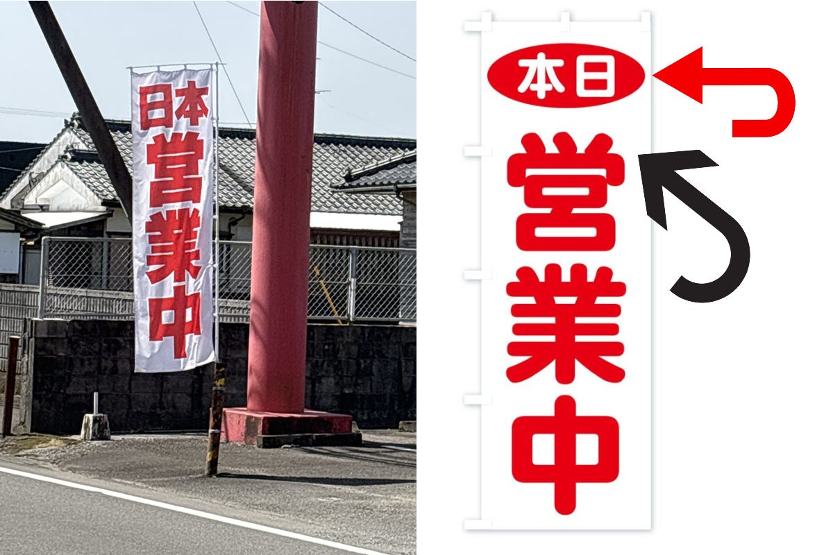
The banner flag captured on film by @babie (left image above) fluttered backwards. Notice the different order of the characters printed horizontally (red arrow)? It appears as the following:
Horizontal (characters written from left to right at the top): 日本 (meaning "Japan")
Vertical (characters written from top to bottom, meaning "open for business," although on closer inspection the character 営 appears flip-flopped)
営
業
中
When viewed correctly (right image above), it should appear as follows:
Horizontal (characters written from left to right at the top) 本日 (meaning "today")
Vertical (characters written from top to bottom, meaning "open for business")
営
業
中
So, from the angle @babie took the picture, this banner flag appears to say "Japan is open for business" when it actually says "(We're) open for business today."
Zoom in: This may seem like splitting hairs, but pay special attention the different directions of the three marks at the top of the character 営 , which means "to operate or conduct a business," and how they appear reversed in the photo (indicated by the black arrow)? It’s a subtle difference. Oddly enough, the font has made even the 営 character almost symmetrical, so that it can be read from the back without any sense of discomfort.

Look closely at the angle of the lines at the top of a part of the Kanji character called a radical. There are many "radicals" used to classify Kanji. The order and direction of the strokes are important.
The two boxes at the bottom are connected in a certain direction (see stroke 9 in the image above). Because the font used to print this banner flag has been simplified, other common anomalies that would normally be obvious when the character is viewed in reverse (e.g., strokes 4 and 5, etc.) are difficult to detect in this case.
Why it matters: Of course, in the grand scheme of things, this is not important. However, for Japanese people and students of the Japanese language, it is kind of funny.

Japanese culture tends to emphasize attention to detail. The Japanese are also highly literate, and learning to read and write effectively with Kanji characters is a revered skill. So it is not surprising that more than 1.3 million people have responded to this tweet.
What they're saying: @babie's post on X drew many responses.
“If everything had been written vertically, it would have been recognizable from the front and the back as intended. When I think about it, the symmetry of the Kanji used is astounding.” - @haskellheads
“It's amazing how symmetrical all the letters are. I thought it was interesting that the one on a local pachinko parlor was also like that, but you could read it from the front and the back.” - @Mimi_haru_
“I see. This is a good mystery.” - @ikeikey
“It's all symmetrical, so it doesn't look out of place when it's turned upside down, it's too artistic.” - @gomadayo2023
“It's frustrating that I didn't notice this before. In case you're wondering, the 営 character is not perfectly symmetrical.” - @TAKATONMAN
“This makes me feel good!”- @lindalinda358
Fun fact: For those who enjoy the symmetry of Kanji characters, consider the case of a long-selling brand of green tea by a Tokyo-based company that can trace its roots back to 1690. This firm claims to be the oldest continuously operating tea shop in the world, and its signature brand of tea, Yamamotoyama2, is now sold all over the world. The brand name is written with three characters that sound the same whether they are read from top to bottom or from bottom to top (which would not be done).

For years their slogan was actually Ue kara yondemo, Shita kara yondemo, Yamamotoyama (上から読んでも、下から読んでも山本山), which directly translates to "Whether you read from the top or the bottom, Yamamotoyama.” Yama (山) means mountain, and moto (本) means "base" in this case. It was, essentially, a palindrome like “racecar” or “noon.”
Commentary: As a student of Japanese, I am always on the lookout for these quirks.
Getting a customer to do a double take with your message can be valuable, but it's not a guaranteed win. While there is no doubt that it grabs attention, increases engagement, and creates a memorable impact, there is a risk that the potential confusion could backfire. This tactic certainly worked well for Yamamotoyama. As for the sign that caused such a stir on X, it may not have been intended to make potential customers do a double take, but it has caught the eye of more than 1.3 million people so far.
What do you think? Have you found similar examples of Japanese characters? If so, please share them in the comments.
Link to Japanese Source: https://grapee.jp/1594014
#banner #flag #doubletake #symmetry #palindrome #のぼり旗 #縦書き #横書き #ダブルテイク #シンメトリー #回文
To add to the confusion (joke), in prewar Japan the language was sometimes written horizontally from right to left, but this was not standard practice.
Yamamotoyama was founded in 1690 in the Nihonbashi neighborhood of Tokyo as a sencha (green tea) merchant. According to the Tea Industry Handbook of the Meiji Era, it was Yamamotoyama's predecessor, Kahei Yamamoto Shoten (山本嘉兵衛商店), that first sold sencha, invented by Soen Nagatani (永谷 宗円), an ancestor of the founder of Nagatanien (永谷園). In 2017, the logo was renewed as part of a corporate rebranding initiative. While the new logo looks like a single Kanji character, it is, in fact, a modification to the "Yamamika" (山嘉) store name crest used during the company's founding period.
I love the notion of Japan open for business. The Japanese yokan maker Toraya writes their name horizontally from right to left and it took me a while to realize it wasn't Yarato.
LORDY, that’s funny.